What colors should be avoided and which be must included for your community? Decide on a few main colors that would be most dominant, but also make a list the other colors to be included. Its also a good idea to keep a “maybe” list of colors.
Is this a quiet mural with low contrast or is it to be brightly colored and bold? What is the feeling that the viewer should experience when seeing the mural? Both colors and aesthetic of the this mural combine together to influence the emotion embedded in the mural.
Color and contrast in combination with the imagery can cause strong emotion by the viewer. Colors can be bright and fully saturated or they can be muted and very quiet. Murals can brighten up the mood of a neighborhood or they can be more somber to help people remember past events or other important matters.
Contrast can come from different hues and they can also come from different values. A hue is pure color that has no white, black, gray or brown mixed in. Value is lightness or darkness of a color. Typically value and hue go together to create an image with variety and depth.
LIMITED COLOR PALETTE
Limited color palettes create greater balance in the mural. Palettes usually include warm and cool colors as well as value contrast. Limited palettes not only help connect a variety of subject matter into one large image, they can also make it easier for community paint days. Similar colors can be mistaken for each other when volunteers paint them onto the wall, so it’s a good idea to keep the colors distinct. Another benefit is that you will buy less paint.
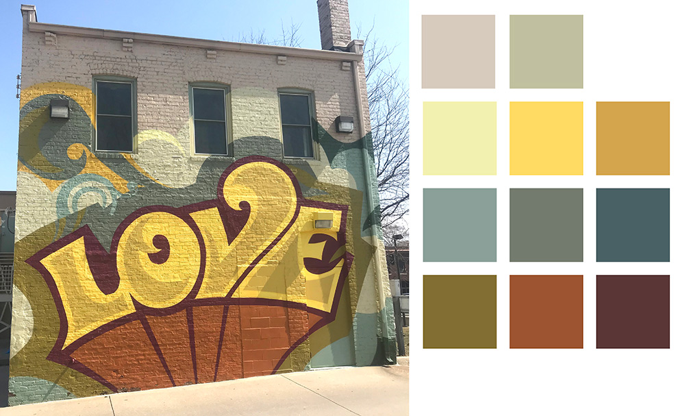
Below is Cey Adam’s mural “Love” on 24th and Lake Streets in Omaha. The curve of the letters is complemented by the curls and curves in the background. The letters are bordered by a darker color to help them show up against the background. This is an example of limited color palette. Instead of using black for contrast, he used a deep shade of red. Its lightest color is a light yellow instead of white. It contrasts cool colors of green-blues and olive green with warm colors of yellows, a rust orange and dark red. Even without using black and white, there is plenty of contrast and this is highly visible from the street from a distance. The simplicity of the design also helps its visibility and legibility from a distance.
WHAT TO DECIDE
PREFERRED COLORS
MAYBE COLORS
COLORS TO AVOID
TYPE OF CONTRAST
Through Dark & Light?
Through Changes in Hue?
Strong or Quiet Contrast?